Government Calendar Web Application
Client
Revize.
Product
Web Application
Role
UX/UI Designer
Time
Mar 4 2025 - Mar 18, 2025
Revize.
Web Application
UX/UI Designer
Mar 4 2025 - Mar 18, 2025
This calendar app, used by municipalities around the country, was far overdue for a redesign. It felt cluttered, struggled with consistent color contrast, and hadn't been given a face lift in a decade.
To keep pace with other app redesigns happening within the company, revize needed this project finished in two weeks. I conducted a UX audit and delivered a rapid redesign, improving accessibility, tightening visual hierarchy, and prioritizing high-impact changes that aligned with development constraints.
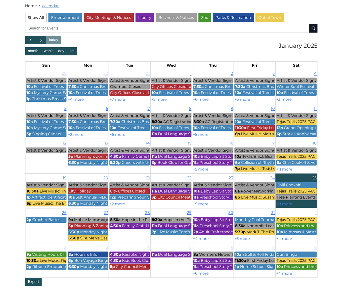
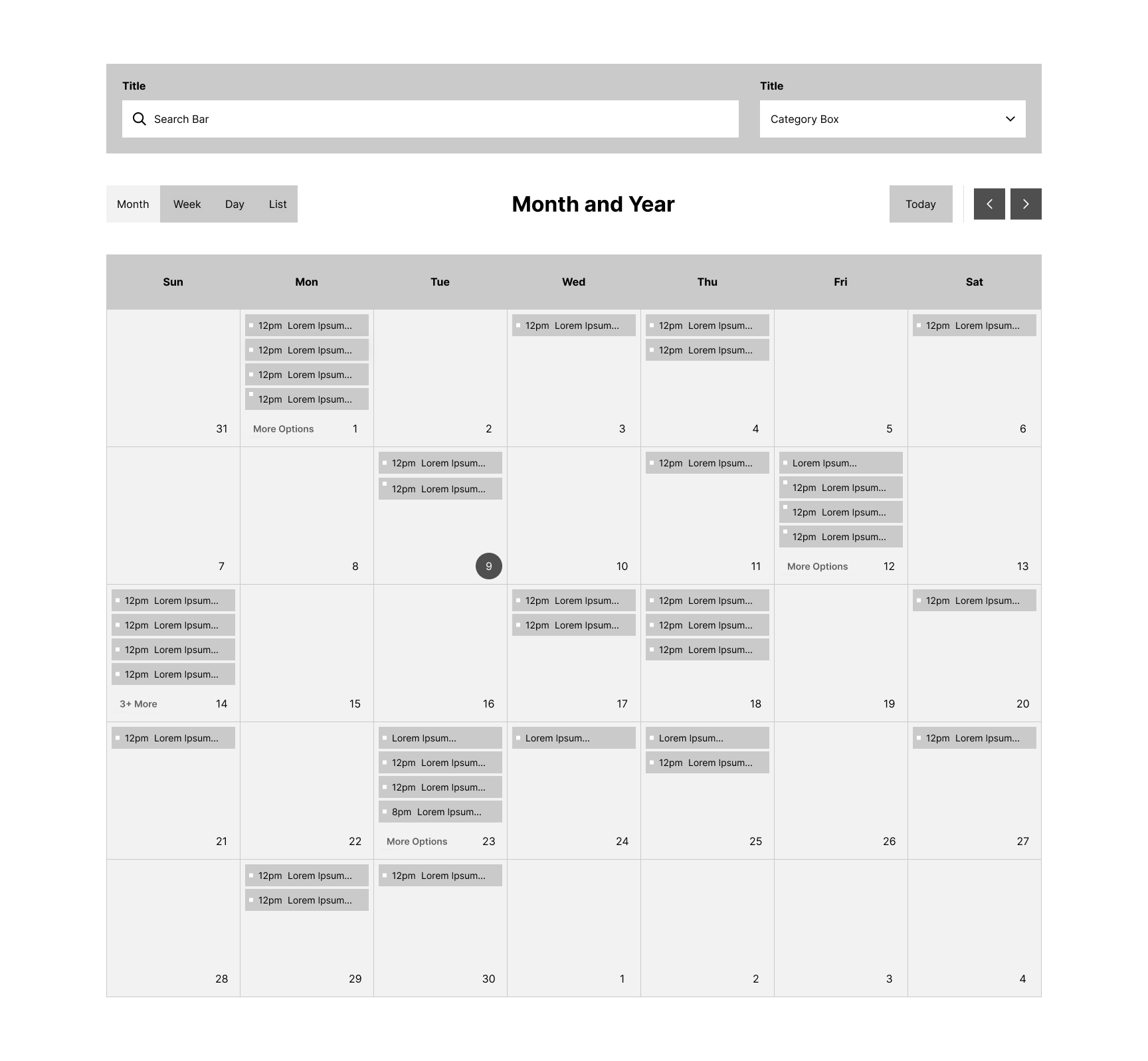
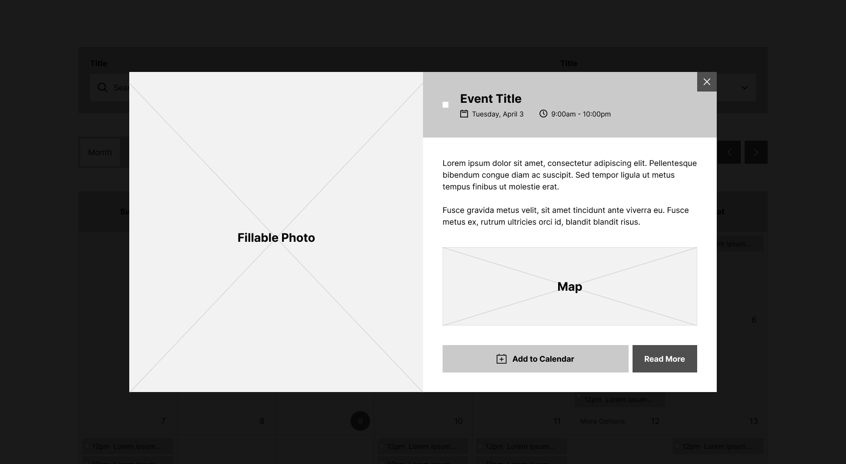
When looking at the old calendar, I'm imagining your eyes are pulled in all directions, so here's a quick rundown. There are category buttons at the top, followed by a search bar, navigation and layout options, then finished by the calendar itself. The calendar has a variety of events, each color-coded by their given category. Clicking on an event opens a small pop-up with more details.
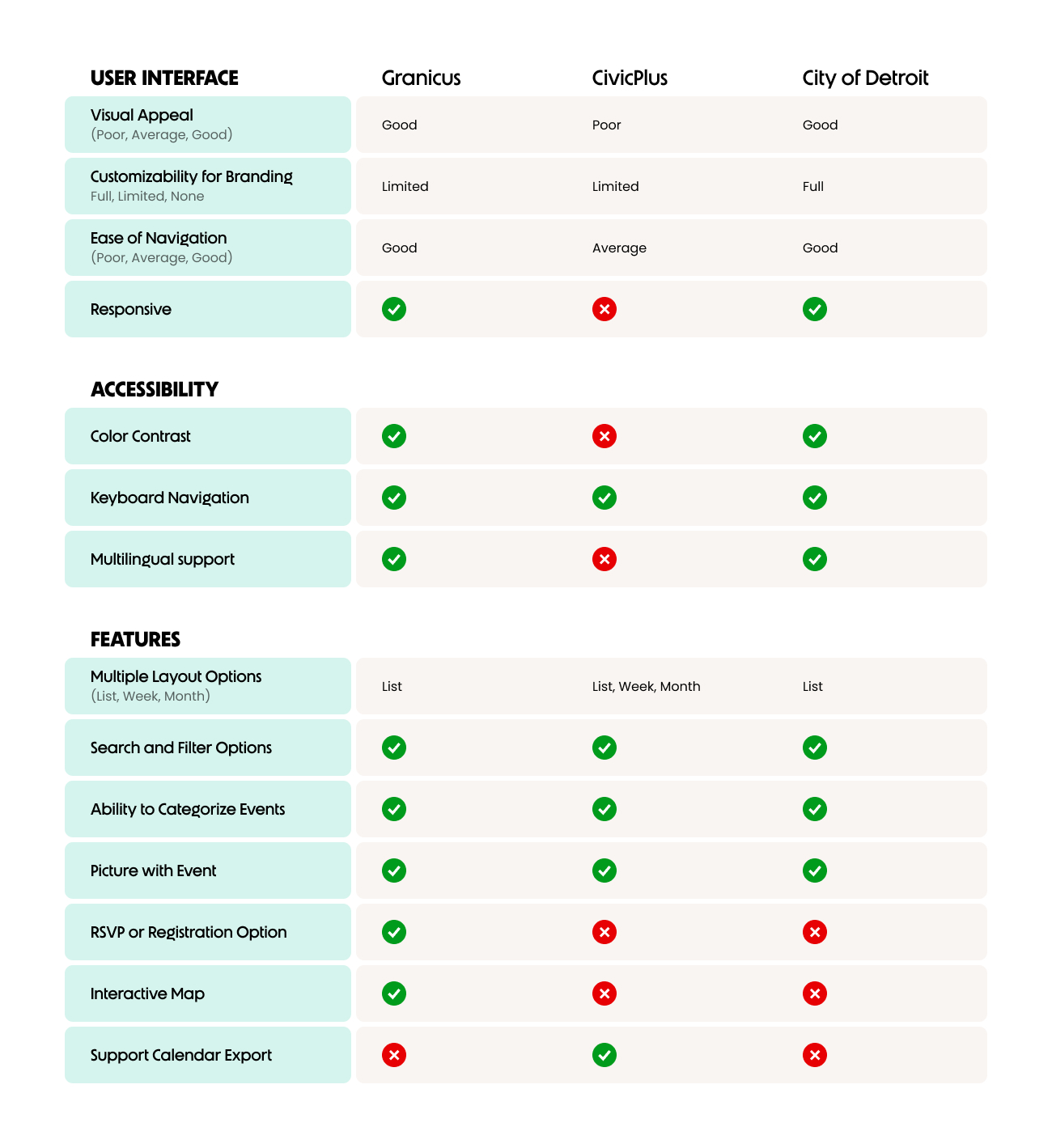
I conducted a competitive analysis to review similar web experiences, focusing on these questions:
The interview portion was a quick but useful step in our research. I met virtually with 5 clients that represented different types of municipalities. Below are the questions asked and key takeaways.
1. Do you have any frustrations about our current calendar application?
2. What type of events do you commonly add to the calendar, and what details do you include?
3. How well do you feel the calendar application matches the design for the rest of your website?
4. What new features would be most helpful for your community?
Participants felt the calendar meets their functional needs but falls short visually. The layout is overall liked, but the UI feels outdated and inconsistent with the rest of their website, making the calendar and other apps feel like a downgrade.
Meetings are the most common events added, followed by community events, with location, date/time, and supporting content being most important.
Aside from frustration with the required event images, users were satisfied with existing features, especially category colors and event pop-ups.
To simplify the wire framing, I wanted to understand which features I could use and how important they are for our target audience. Ranking them helped visualize which options should be included.
As nice as it would be to only follow my own list, I needed to also consider development constraints. They had their own tight deadlines to follow, so I limited my changes by not making entirely new components. Instead, I focused on enhancing what we have.

Stakeholder discussions and user interviews showed the existing calendar has the right features, but needed the user experience to be refined. Our goal from here was to modernize the UI and resructure content placement to improve usability.
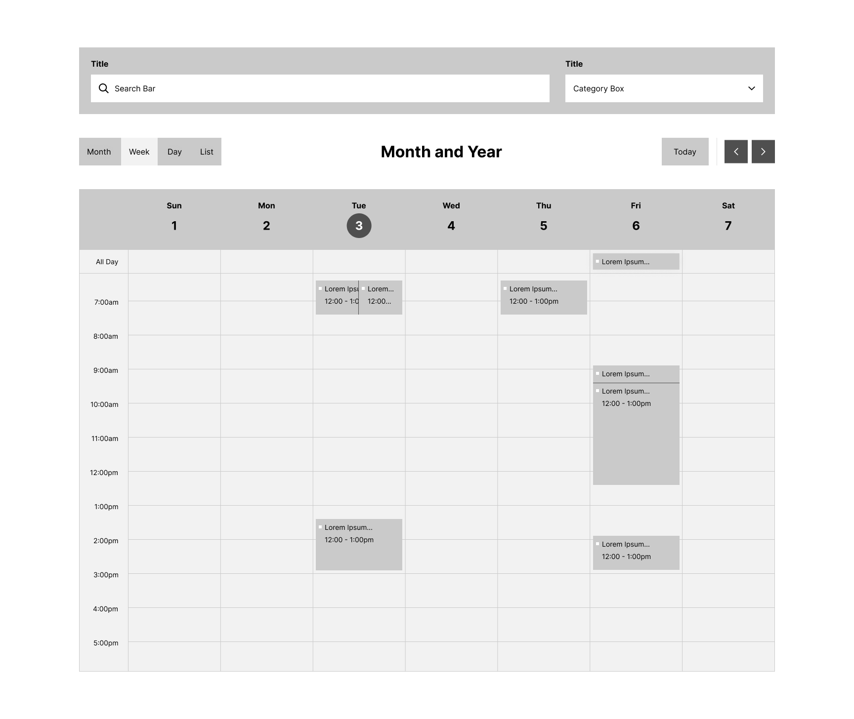
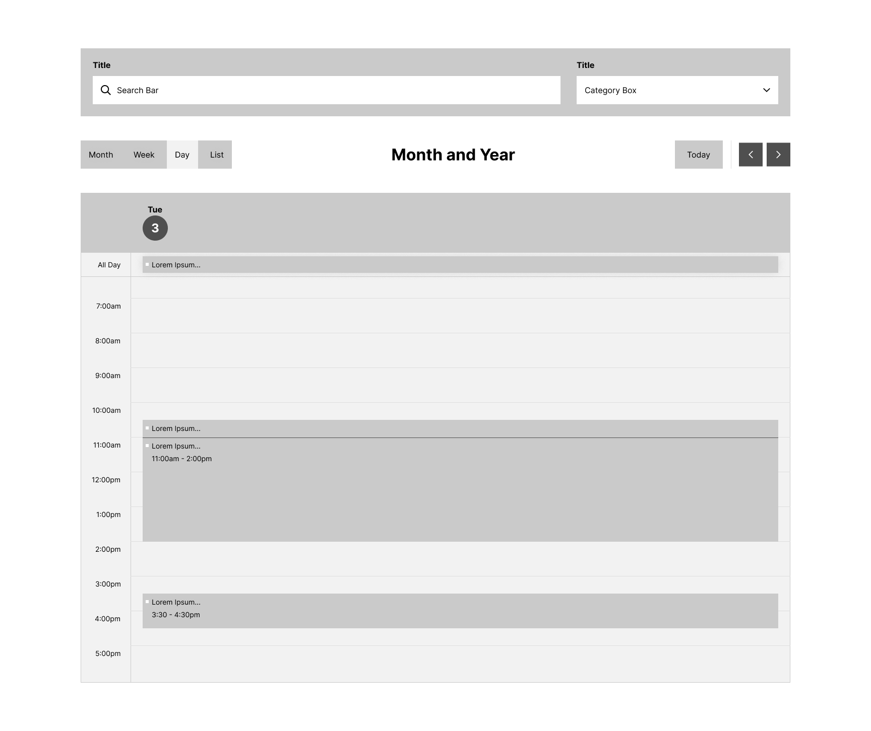
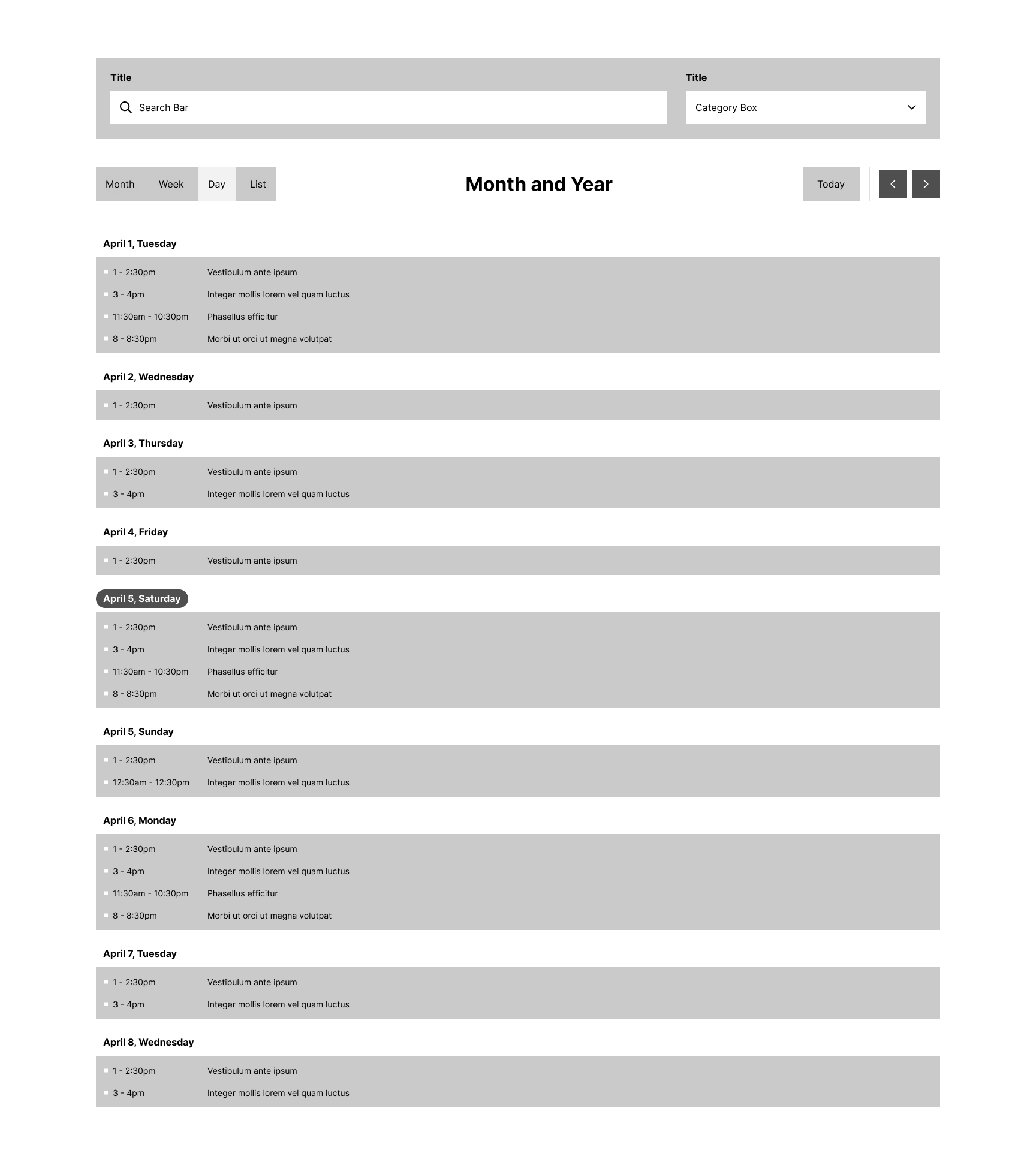
Wireframes were created to establish the structure of the application and key journeys like the multiple calendar layouts and the event pop-up.
After discussing the wireframes with stakeholders, I could move on to finalizing the UI and prototyping. It incorporates these UI components into a clean interface, balancing functionality with visual appeal. All elements, like the events and category selection, are interactive to encourage user participation. The app is designed to make large amounts of content easy to navigate.