Brand Design
Considering the Use-Case
Knowing who, how, and where the brand will be used can impact creative decisions. Will sales be making their own presentations to match the brand? Will there be physical use-cases, or only digital? This is what was determined:
- Important material will be made by designers and other employees should not make alterations
- The brand usage will almost entirely be digital, with limited physical applications such as custom packaging and conference materials
- When non-designers need to make their own material, they should have assets (i.e., icons and graphics) they can easily utilize
Starting with a brand direction
The major areas the brand needed to hit was showcasing our creativity, while also being clean and minimal. The goal would be to reflect our focus on custom websites and a easy-to-use CMS.
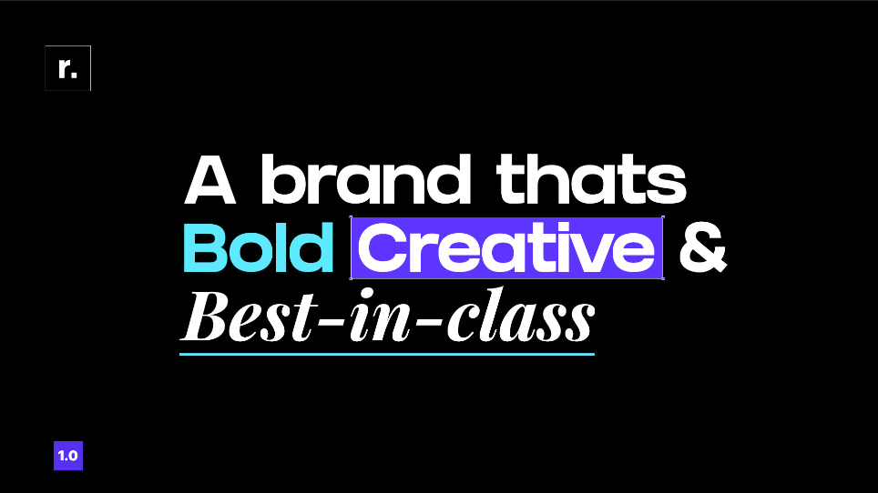
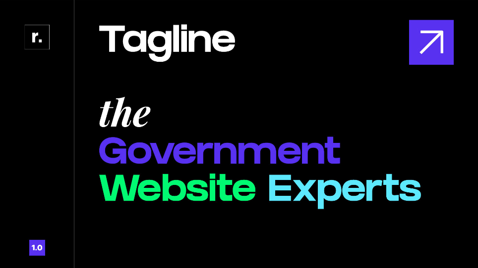
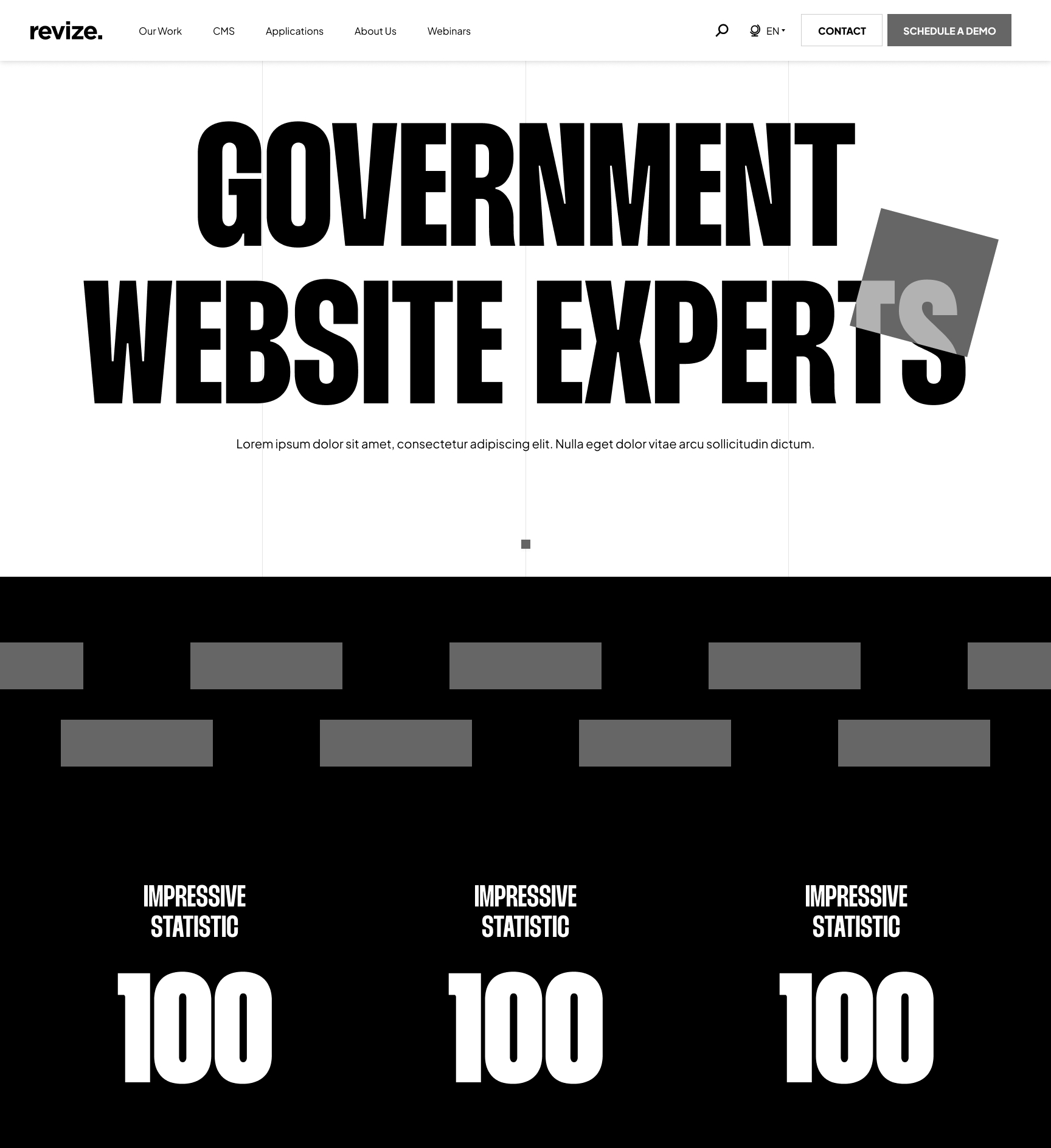
While I was ideating my own concepts, my stakeholder, who has 20+ years of experience in design himself, created his own vision. This is what we used as a starting point for me to build off of:


Areas to Adjust
To build off this starting point, I needed to layout the key areas and how they could be improved:
Color Usage
The touches of color in an overall black/white color scheme help the brand remain professional, while adding spurts of creative elements.
Could we create a color scheme that flows better together and is accessible?
Fonts Combinations
The goal for the initial font combination is to be bold while highlighting certain elements.
Do these fonts work together and reflect Revize's values? What other font options would keep a bold and creative approach?
The Square Graphic
The revize square is in the logo and is the most iconic part of the existing branding.
What ways can we incorporate it into the new branding while maintaining a clean and minimal style?
Creating a Final Concept
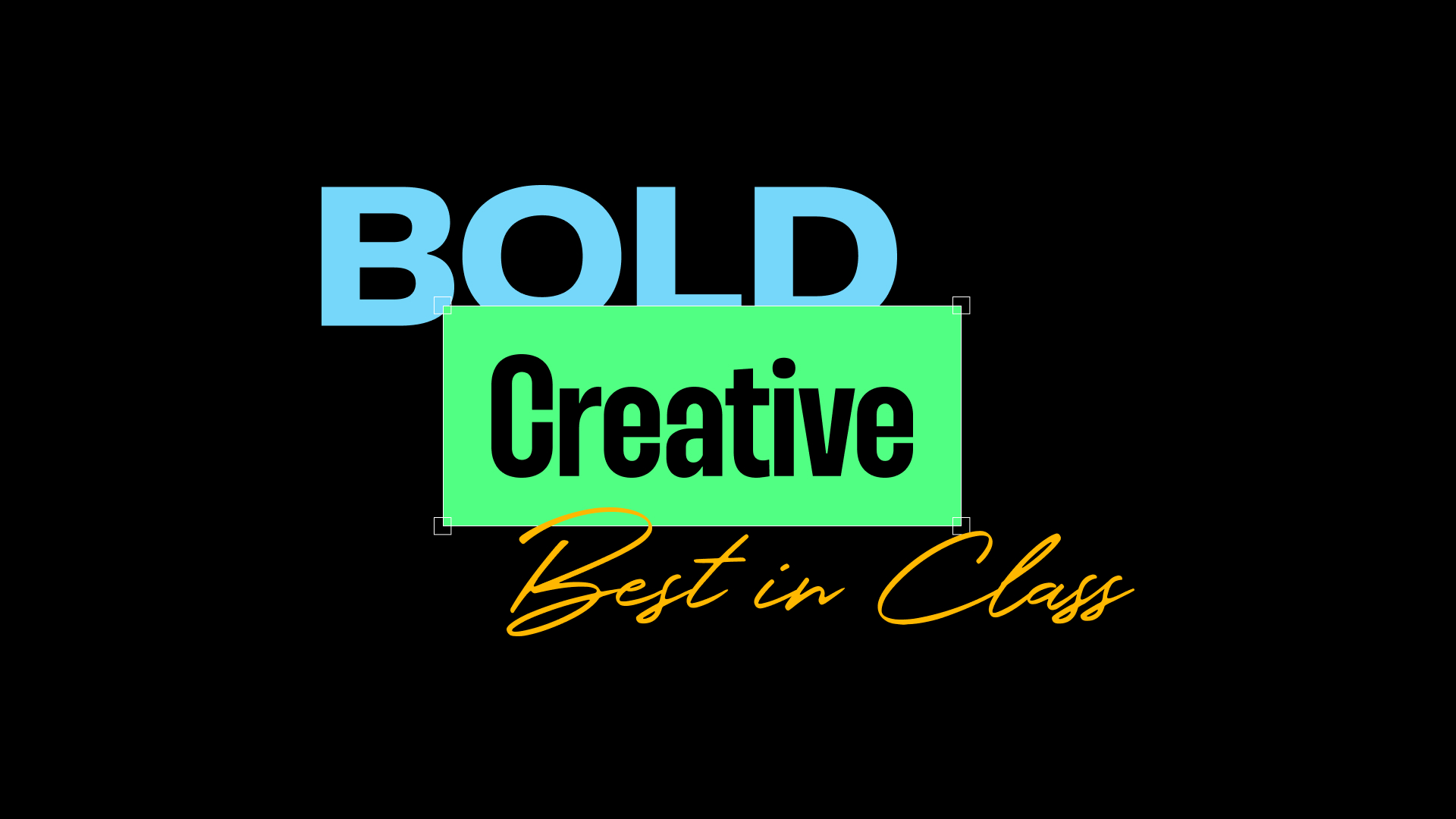
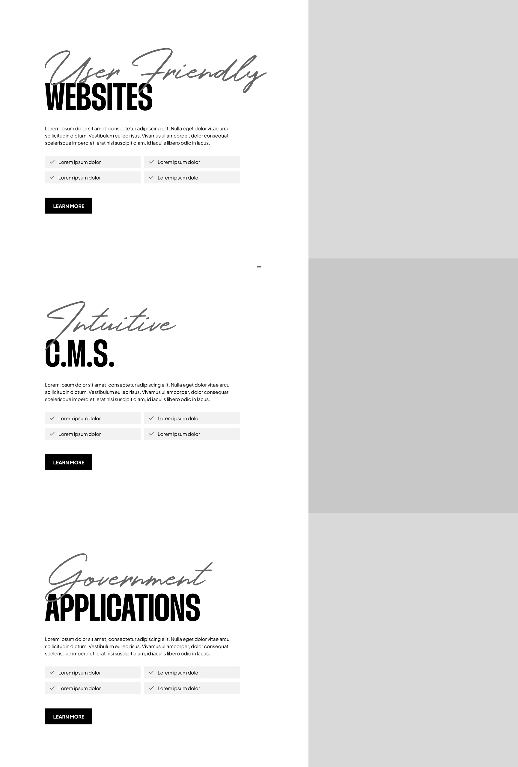
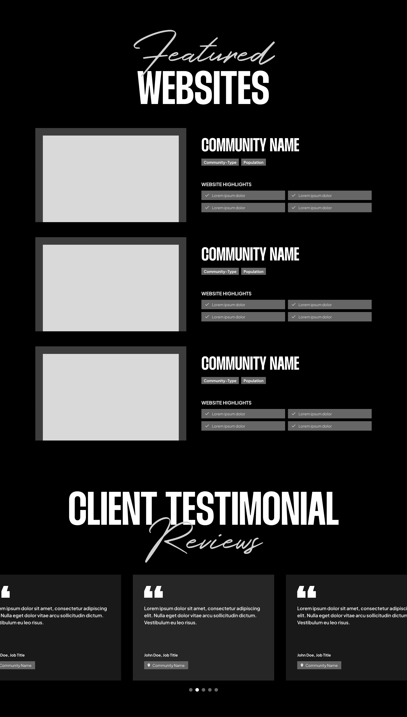
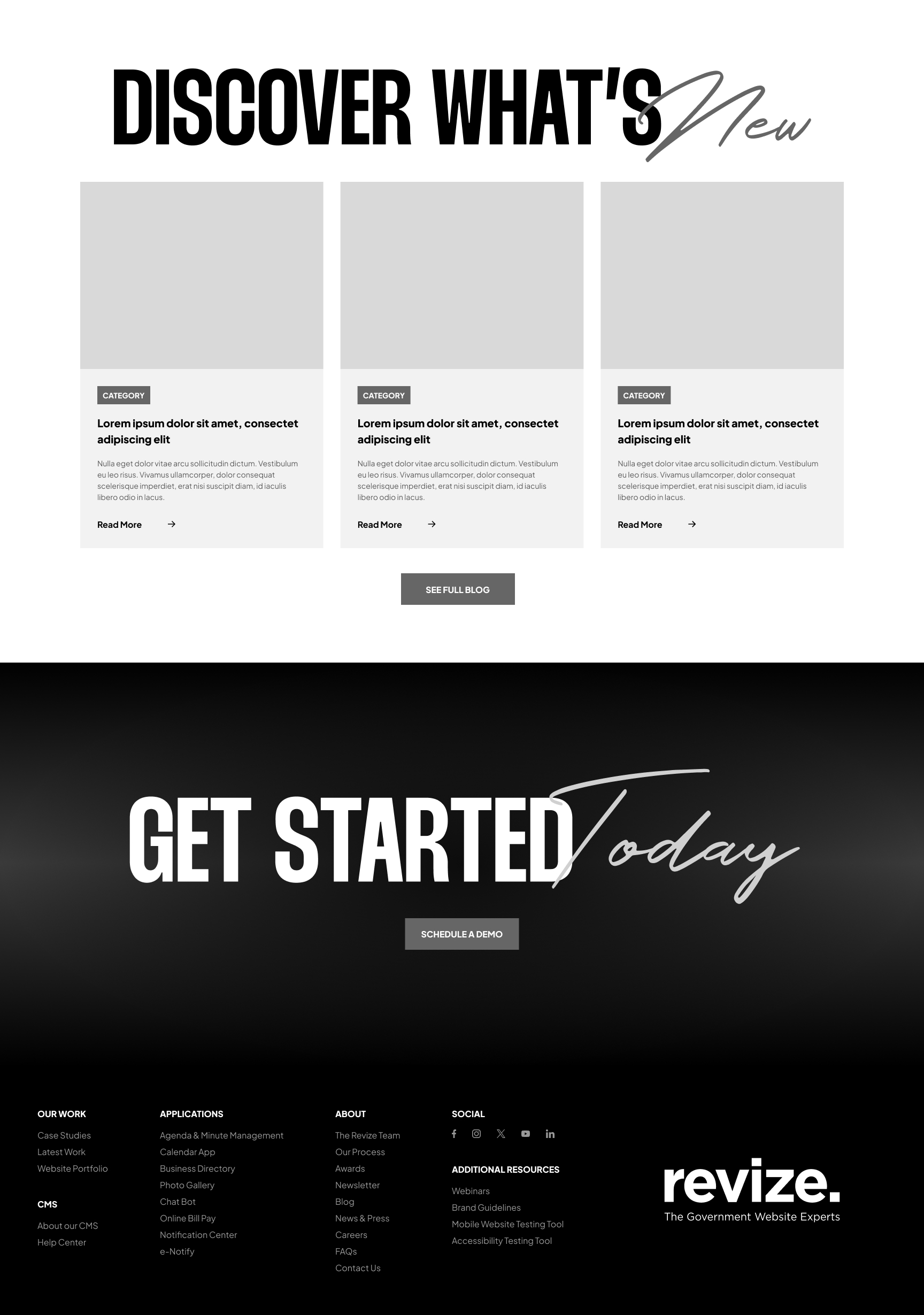
After exploring different brand variations through graphic experiments, I created the design you see below. It brings an energetic, creative, and professional feel that reflects what Revize stands for.


Lessons Learned
This project had its ups and downs, but there were a lot of great moments too. In the end, my stakeholder was happy with the final result. It also taught me some valuable lessons that I'll take with me moving forward.
Creating a Proper Starting Point
Branding plays a crucial role in shaping a company’s identity, influencing future materials and how the audience perceives them. Looking back, I wish I had been more thorough during discovery. As I developed mood boards and style tiles, I realized they weren’t enough for my stakeholder to grasp the direction I was envisioning. This led him to create his own starting point instead.
In hindsight, rather than presenting these early iterations, it would have been more effective to design a few sample graphics or marketing materials to communicate the concept before moving forward with a branding guide, which he immediately requested based on his own version.
Balancing Creativity and Accessibility in Typography
This ties back to the importance of being thorough, but as a strong advocate for accessibility, I was initially hesitant about using a handwritten font. While it effectively conveys values like creativity, a human touch, and high-quality service, its use must remain purely decorative. It should never be essential for understanding a title’s message.
Overall, I’m pleased with the choice, as it adds character to the brand. However, for future projects, I believe it would be worthwhile to explore alternative options to ensure best practices are met.

